Added: 16 August, 2007
Group: Photoshop
Web 2.0 Style Text Tutorial
Author: Larry
page: 1
Web 2.0 Style Text Tutorial
Did you always ask your self "how to create that web 2.0 style text". Here I give you the instructions how it's made.

Note: This tutorial works for Photoshop 7 + up, including Photoshop CS3 (the latest version of Photoshop). In fact, this tutorial was done on a Photoshop CS3 but I have started using Photoshop since Photoshop 7.
Also, note that the blue colored regions are to attract your attention to what I am talking about.
Terms
Layer thumbnail:

Step 1. Create a new document. File > New.
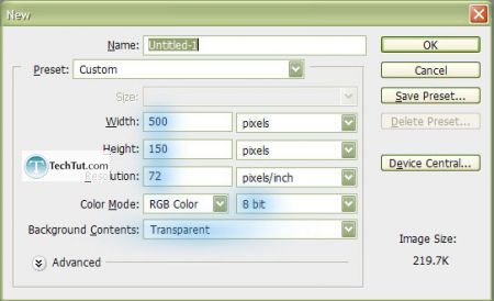
(RGB Color & 8 bit, Transparent, and choose an appropriate size)
Step 2-1. Type text using a font that is not too small (the lines can be thin but if the lines are very close to each other, this effect wont work as well). Also, once we get on to Step 3, there is no turning back once you type now will be what you get in the end.
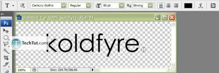
This font is Century Gothic, which is a font I use a lot for title and such, but its not an ideal font for text in paragraphs.
Note: this font is slightly to skinny so we will be doing an optional Step 2-2.
Step 2-2. We will be using a technique to thicken up our text. This requires us to Rasterize Type to do this, right-click on the layer which contains your text. In other versions of Photoshop (all versions below Photoshop CS3) it may be listed slightly different.
Rasterize type:
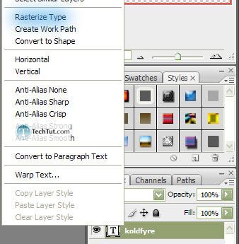
It should change from being like this:
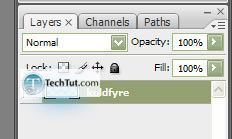
To this:
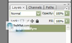
Next, while holding down the Ctrl key, click on the layer thumbnail:

Go up to the Select menu and under Modify, click on Expand (Select > Modify). In the following dialog box, enter 1-2 pixels. Then press the D key on your keyboard (which sets the foreground and background to black and white respectively. Finally, press Alt + Backspace in order to fill the selection with the foreground (black).
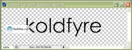
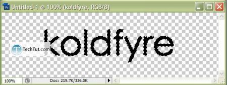
1 pixel was used in this example, and this thickness is just good. Making the text too thick can be just as bad as making it too thin.
Step 3 (finally :P). Duplicate the layer and place above the original layer. Then Ctrl + click on the layer thumbnail. Press D key (on your keyboard, which sets the foreground and background to black and white respectively) and then press the X key (which switches your foreground to your background and vice versa). Finally, press Alt + Backspace in order to fill the selection with the foreground (white).
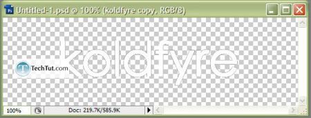
Now set the opacity of the duplicated layer (which is the white text above the black) to 50%.
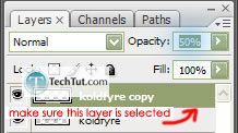
And then using the Elliptical Marquee Tool
 , make a selection like such:
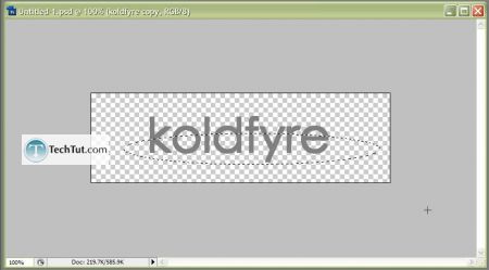
Then Del this part of the duplicated layer.
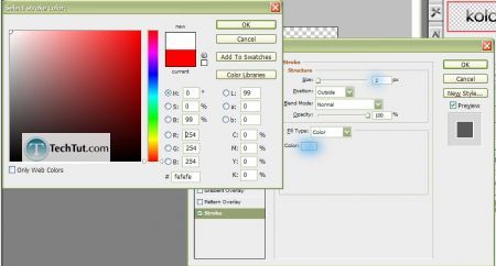
Step 4. Right-click on your original layer then select Blending options , click on Stroke, set your Size to 2, and click on the red box to switch it to white. Then click OK.
Step 5. Choose your color! While having the original layer selected, press Ctrl + U or go to Image > Adjustments > Hue/Saturation . Click on the Colorize checkbox, then first set your Lightness to +40 and your Saturation to 50. Then, play around with the Hue until you have the color text you like.
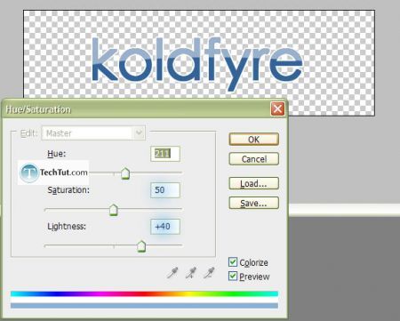
Final:


GO to: Page 1 : Web 2.0 Style Text Tutorial
TechTut.com This tutorial is copyrighted. Partial duplication or full duplication is prohibited and illegal. Translation or usage of any kind without author�s permission is illegal.

 Join our RSS feed
Use our RSS feed to get the latest published tutorials directly to your news reader.


